Enough Stuff Case Study
Creating an easy inventory app that helps people know when they have enough.

The inspiration for the Enough Stuff inventory app for i0S came to our iOS developer, Forrest Anderson, during the coronavirus pandemic. After stocking up on some supplies to shelter at home, he decided he needed a way to keep track of them. He checked other inventory apps, but decided they were too complex for the purpose and built his own over a couple of days.

Creating an easy inventory app that helps people know when they have enough.
The inspiration for the Enough Stuff inventory app for i0S came to our iOS developer, Forrest Anderson, during the coronavirus pandemic. After stocking up on some supplies to shelter at home, he decided he needed a way to keep track of them. He checked other inventory apps, but decided they were too complex for the purpose and built his own over a couple of days.


The Challenge
During the pandemic, many people have stocked up on food and other supplies so they can shelter at home. It hasn’t taken long, though, for many of them to run out of space and a need for more supplies.
Many people now need a way to keep track of what they have so they don’t run low on items or buy too much. This app, Enough Stuff, is intended to help users solve that problem by enabling them to keep track of items they have purchased and how much they still need.
Developer’s Sprint
Developer, Forrest Anderson had a clear vision of this app from the beginning, so he bypassed the standard research and design process and wrote most of the code for the app in a couple of days.Then he and developer colleague Austin Blaser put the finishing touches on the app's function.
Design
The app works like this:
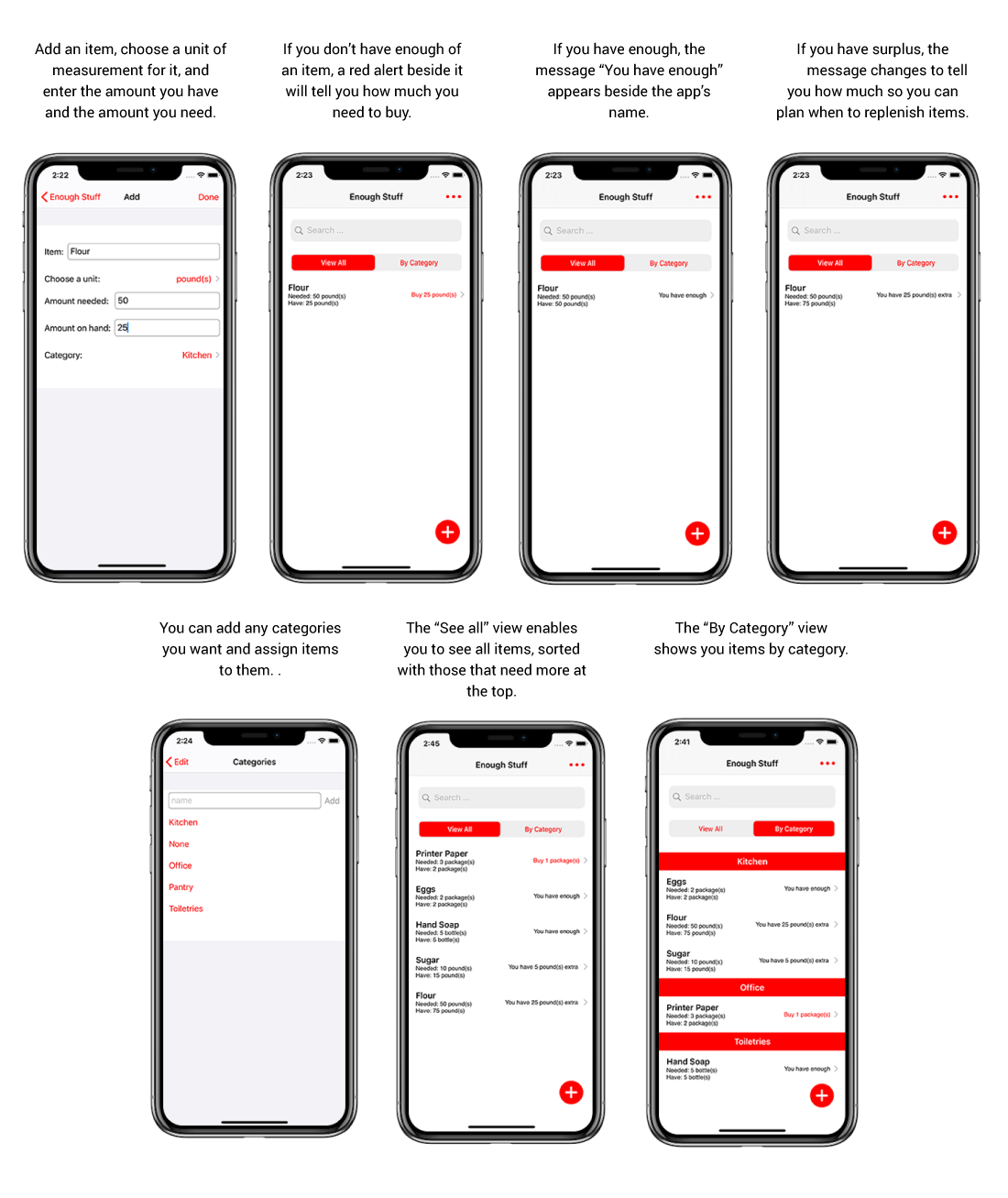
A user inputs each needed item into the app, along with the amount they have and the total amount they need. If the user doesn’t have enough of an item, the app will show them a red alert that tells them how much they need. When they reach their goal for an item, the app tells them “you have enough”. If the user has more of an item than they need, the app tells them how much they need to buy.
The user can customize the app with different categories. They then have a choice of viewing all items in a list with needed items at the top or viewing items by category.
Customer's Journey

Forrest and UX designer Donna Rouviere Anderson worked together to refine the app’s visual design and come up with the name Enough Stuff for the app.
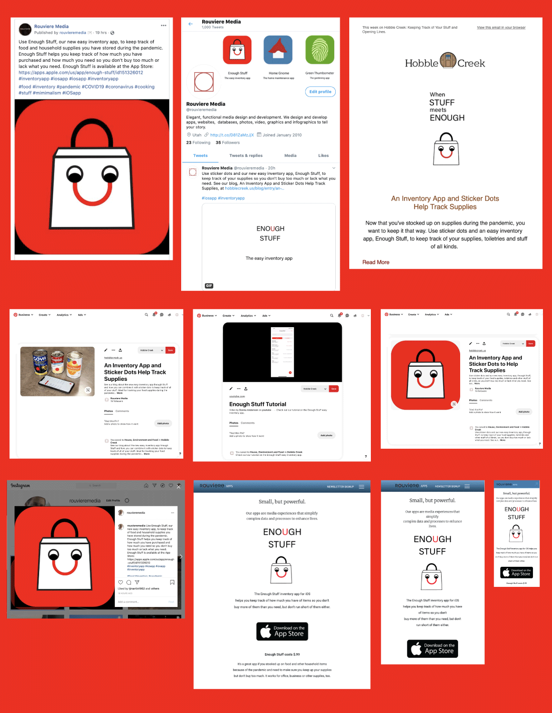
Donna then created and animated an introduction for the app using After Effects and Lottie, as well as a YouTube video tutorial and animated GIFs for Facebook, Twitter, a blog and a MailChimp newsletter.

Donna wrote the blog about the app and designed the newsletter about it as well as designing the social media campaign about its launch.
We are continuing to add upgrades and new features to the Enough Stuff app and are committed to providing support for the app and its users on an on-going basis.